Have you ever gone to a website and felt like something was wrong right away, before you even read anything? The colors were probably doing something wrong. Color is one of the most important parts of web design, and most people don’t realize how much it affects how people feel about a brand.
Color theory explains how colors work together, look good together, and stand out from each other. For hundreds of years, artists and designers have used it. In web design, even knowing the basics can make the difference between a site that looks professional and trustworthy and one that people quietly click away from.
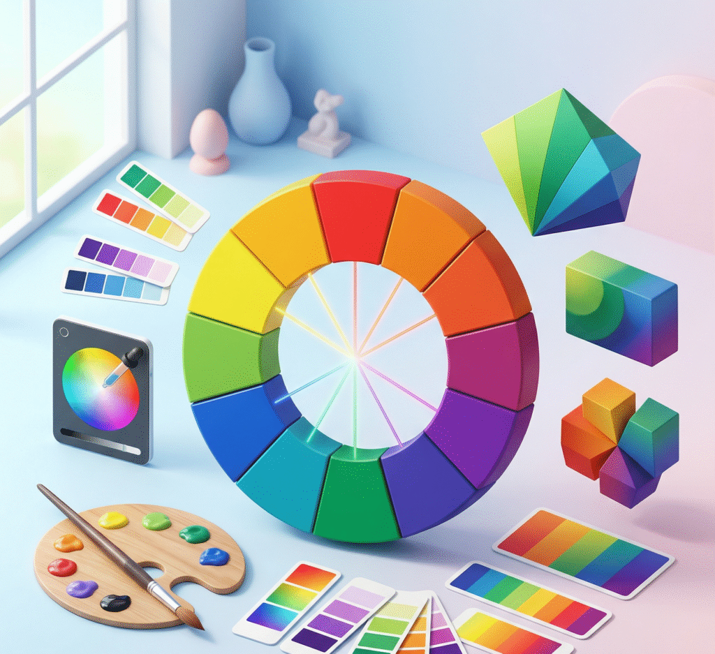
Begin with the color wheel
The color wheel is a circular diagram that shows how primary colors (red, yellow, and blue), secondary colors (orange, green, and purple), and tertiary colors that sit between them are related. This is the first step in color theory for web design. Knowing how these colors work together will help you make color combinations that work instead of just picking colors that you like.
The wheel is where most web designers get their color schemes from. Colors that go well together are on opposite sides of each other and make a strong contrast. This is great for call-to-action buttons that you want to stand out. Colors that are similar to each other sit next to each other and look good together. This makes them great for backgrounds and other elements that shouldn’t compete for attention. Triadic color schemes use three colors that are evenly spaced apart to make things look bright and balanced. If you know what scheme your site uses, every color choice will have a clear reason.
What Each Color Is Really Saying in Color Psychology
People often don’t realize that every color has meanings that affect how they feel. Banks, tech companies, and healthcare providers use blue a lot because it means trust, dependability, and professionalism. Green stands for health, growth, and long-term success. Red makes people feel like they need to act quickly, which is why it’s so common in sale banners and calls to action. Yellow stands out, but too much of it can be too much. Black means power and luxury. White makes things clearer and gives them more room.
Cultural ties are also important for Indian businesses. In India, white is often associated with death, while saffron has a lot of religious meaning. In one market, a color that seems safe and neutral might mean something else in another. When picking the colors for your website, think about who will be looking at it and what those colors mean to them, not just what they mean to you.
Contrast and Readability; Often Overlooked, Always Critical
You can have a beautiful color palette and still produce an unreadable website if your contrast ratios are off. Light gray text on a white background might look minimal and clean in a design mockup, but it frustrates real users trying to actually read your content. Web Content Accessibility Guidelines (WCAG) recommend a contrast ratio of at least 4.5:1 for normal text. Tools like WebAIM’s contrast checker make the task easy to test before you go live.
Good contrast in web design isn’t just an accessibility issue; it’s a conversion issue. Buttons that don’t stand out don’t get clicked. Headlines that don’t contrast with their background don’t get read. Getting this right is one of the simplest ways to improve how your site performs without changing a single line of copy.
How to Build a Web Design Color Palette That Works
People often don’t realize that every color has meanings that affect how they feel. Banks, tech companies, and healthcare providers use blue a lot because it means trust, dependability, and professionalism. Green stands for health, growth, and long-term success. Red makes people feel like they need to act quickly, which is why it’s so common in sale banners and calls to action. Yellow stands out, but excessive use can be overwhelming. Black means power and luxury. White makes things clearer and provides them more room.
Cultural ties are also important for Indian businesses. In India, white is often associated with death, while saffron has a lot of religious meaning. In one market, a color that seems safe and neutral might mean something else in another. When picking the colors for your website, think about who will be looking at it and what those colors mean to them— not just what they mean to you.
How Just Web Infotech Approaches Color in Web Design s
At Just Web Infotech, color isn’t an afterthought, it’s part of the brief. When we design websites for businesses across India, we start by understanding the brand’s audience, industry, and goals, then build a color palette that reflects that deliberately. Every web design project we take on considers how colors interact, how they’ll perform on mobile screens, and whether they’re accessible to all users. The result is a site that doesn’t just look good, it works.
Color Theory Is a Tool Use It
You don’t need to spend years studying art theory to make smart color decisions for your website. You need to understand the basics of how colors relate, what they communicate, and how contrast affects readability. By mastering these fundamentals, you will surpass most businesses that choose colors based on personal preference and rely on luck.
Frequently Asked Questions
What is color theory in web design?
Color theory in web design is the use of principles about how colors relate, contrast, and interact to make deliberate, effective color choices for a website. It covers color wheels, complementary and analogous schemes, psychology, and contrast ratios.
How many colors should a website use?
Three to five is the sweet spot for most websites: a dominant brand color, a supporting color, an accent for buttons and highlights, a neutral for backgrounds, and a dark tone for text. More than five and the design starts to feel cluttered and unfocused.
Does color really affect conversions on a website?
Yes, in a meaningful way. The color of a call-to-action button, the difference in color between the headline and the background, and the emotional tone of your palette all affect how people feel and act on your site. Color is not just for adornment. It’s talking to each other.
Can Just Web Infotech help with color choices for my website?
Yes, for sure. Choosing colors is an important component of every web design project we work on. We make palettes based on your brand, your audience, and what we know about how colors look on different sorts of screens and devices, especially mobile devices, where colors can look different.